January 2025: Roland's MOD
- Heather Bungard-Janney
- Feb 7
- 5 min read

If you've followed this blog for very long, you'll know that I do a lot of black scrolls. One of them, a couple of years ago, was a Dragon's Heart for Roland de Sullane, which I've detailed in another blog post. Well, it turned out that he and his partner liked it so much that, when he was offered elevation into the Order of Defense, they decided I was the only choice to do his peerage scroll. They wanted another black scroll, but beyond that, I was given free rein to come up with anything I wanted.
Roland has a late-period persona, as many rapier fighters do, since the fencing manuals that have survived to present day generally come from the late 1500s. I knew I wanted to include a portrait of Roland (which may have been part of the commission request, I can no longer recall), but beyond that I wasn't certain at first what I would do with layout and so on.
This first photo is of my cat, Noodle, assisting with layout and design in her own special way.

I doodled several layout options. I knew I was going to have minimal decoration on this scroll, with just a portrait of Roland in the central oval and the kingdom seal in the circle below it, but beyond that, I wasn't yet certain which layout would be best.


The layout above is closest to the one I went with, but this one is in a "portrait" or vertical page orientation, while I ultimately ended up working with the page turned horizontally in "landscape" orientation instead. You'll see why in a couple of photos below.
I knew that a later period script would be necessary as well; a good Italian or even Elizabethan secretary hand was the order of the day. These have a slanted letter orientation, which is not used in the other alphabet styles that I know, and getting that slant to be consistent can be very difficult. Secretary hands are also often more cursive, meaning the letters run together from one to the next rather than being written separately, but I wanted the formality and legibility of a less cursive script. The sample below is one of several test runs I made.

Another unusual aspect of this alphabet is the line spacing; rather than putting the body of each letter on every third line, in order to make room for the exaggerated ascenders and descenders, I wrote on every fifth line instead. Two lines above the body, plus two more lines below, to give room for everything to really flourish. This also allowed me to go with a thicker nib, in order to really show off those flourishes and keep the letters from looking too "spidery" (my term for the opposite of bold, I guess).

The photo above shows the problem I ran into with the page oriented portrait style; there simply wasn't enough text to fill the space! Turning the page horizontally, to landscape orientation, solved the problem nicely.
For the portrait oval, I probably could have calculated how best to draw the ellipse with a compass and straightedge, but it was far easier to go online, tell the computer to create a template in the length and width I wanted, and then print it off to trace.

Here is the finished text - almost. I'm not sure when I got the idea, but I remember giggling madly with Roland's partner Rue about the possibility of including one or more Elizabethan-era ciphers to spell out a hidden message. Rue agreed that the idea was a fun one, so I went ahead with not one but two very simple ciphers.
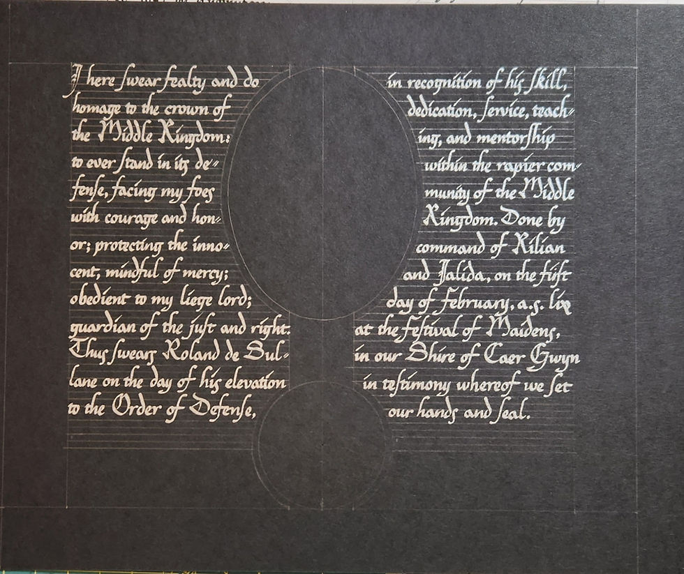
The letters highlighted in blue are a steganographic cipher - information hidden in plain sight by making the letters of the message a shape, font, or in this case color. This message is from Roland's family.

A second message, this time in green, simply reads, "Greetings from Matildis". There is actually a mistake in this message that I didn't notice until later! "Matildis" has an incorrect letter highlighted, so that it says "Maaildis" instead. I did catch it in time to correct the mistake.

Next it was time for the hardest part - getting a realistic and accurate portrait of Roland into that oval. If your proportions are even slightly off, you end up portraying people who are not the ones you intended. For example, I somehow managed to get a fairly decent rendering of Anton du Marais on my first try...

And then somehow a young Duke Edmund in my second attempt. I had photo references, so I'm not 100% sure how this kept happening.

Here is Roland in his black and silver clothing, receiving an award in court. Photo supplied by Rue Bryne, used with permission. Maybe it's because in these photos his face is aimed slightly to the right, and in my portrait he's looking left instead.

Regardless, I finally got the image right! Rue supplied other photos of the garb he would be wearing for his elevation, so I incorporated all of those details into this portrait.

At last it was time to paint. With black paper you get to build up the light gradually, with translucent layers that become more opaque and brighter as you go. You can see this around the shadow of the nose and especially on the hand.

Of course I got the eyes ever so slightly wonky. This still bugs me, but the rest of the clothing makes me pretty happy. I was given reference images for the clothing and also for the specific sword hilt that Roland would be receiving as part of his elevation ceremony.

It was about here that I noticed the error in my green cipher. I had to very, very carefully scrape the green layer off the silver with a scalpel, and then repaint the correct letter right next to it.


Here is the portrait nearly finished. I decided the background needed just a little something to bring the overall image to life and set it apart from the rest of the scroll...
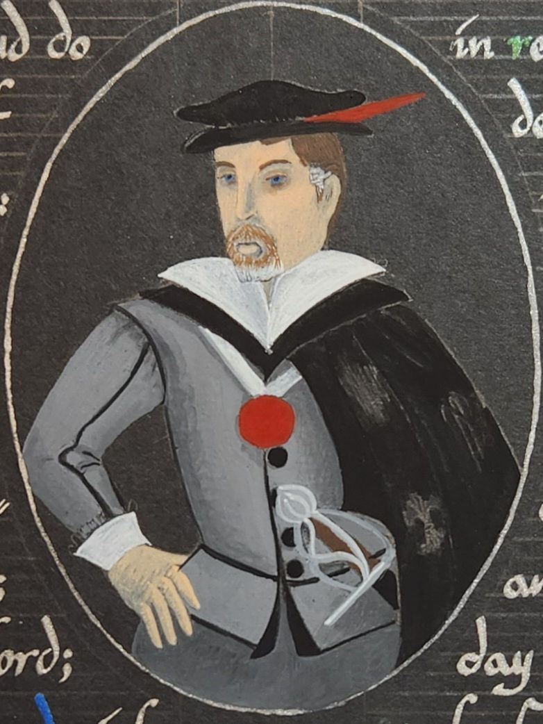
A red wash ended up being the perfect thing to bring out the medallion, the feather in Roland's hat, and to set apart the image from the rest of the piece. A silver outline for the oval finished it nicely.

And here we are with the finished scroll. Roland was wearing this exact outfit and received this sword on the day of his elevation, and he found me afterward to express his thanks. I may have been able to erase the pencil lines, but I was concerned about smudging the silver and the ciphers. All in all though, this is a scroll I was happy to do, and I'm pleased with the result.

As always, I hope you've enjoyed this post and found it helpful, educational, or at least entertaining.


Comments