February 2024 - Ketubah illumination
- Heather Bungard-Janney
- Sep 15, 2025
- 8 min read

My entire blog up until now has consisted only of SCA-relevant art pieces. I've been doing fewer of those lately, because commissions outside the SCA have started to demand my attention, but after checking in, my readers have said they would like to see my modern pieces as well, so here we are: my first non-SCA post, but still very definitely related to the scribal arts. I hope you enjoy it.
In April of 2023, I was approached by a friend to do her ketubah - a traditional Jewish piece that goes back hundreds of years. Originally they were something like a wedding contract, outlining each spouse's obligations to the other, as well as a legal declaration that the couple were married before witnesses. Nowadays they are certainly less contractual, although they do still include the "marriage certificate" part, and more a celebration of the couple's marriage.
The intimidating thing is, a modern American ketubah would be written in both Hebrew and English, and I know nothing of Hebrew. I was willing to attempt to copy text if needed, but it was not my preference. I acquired a book on Hebrew calligraphy, and even started a page of Hebrew letter practice, but ultimately, the couple put me out of my misery, found a source for a beautifully printed ketubah, and asked if I could just do the illumination instead.
There was much rejoicing.
As always, I broke out the graph paper and began a mockup, measuring carefully and trying to determine how best to include everything the couple was interested in. If you look below, you'll see that the page is actually quite large - apart from Bran's knighting scroll, this is the largest piece I've ever done. 17x25 inches, I believe?

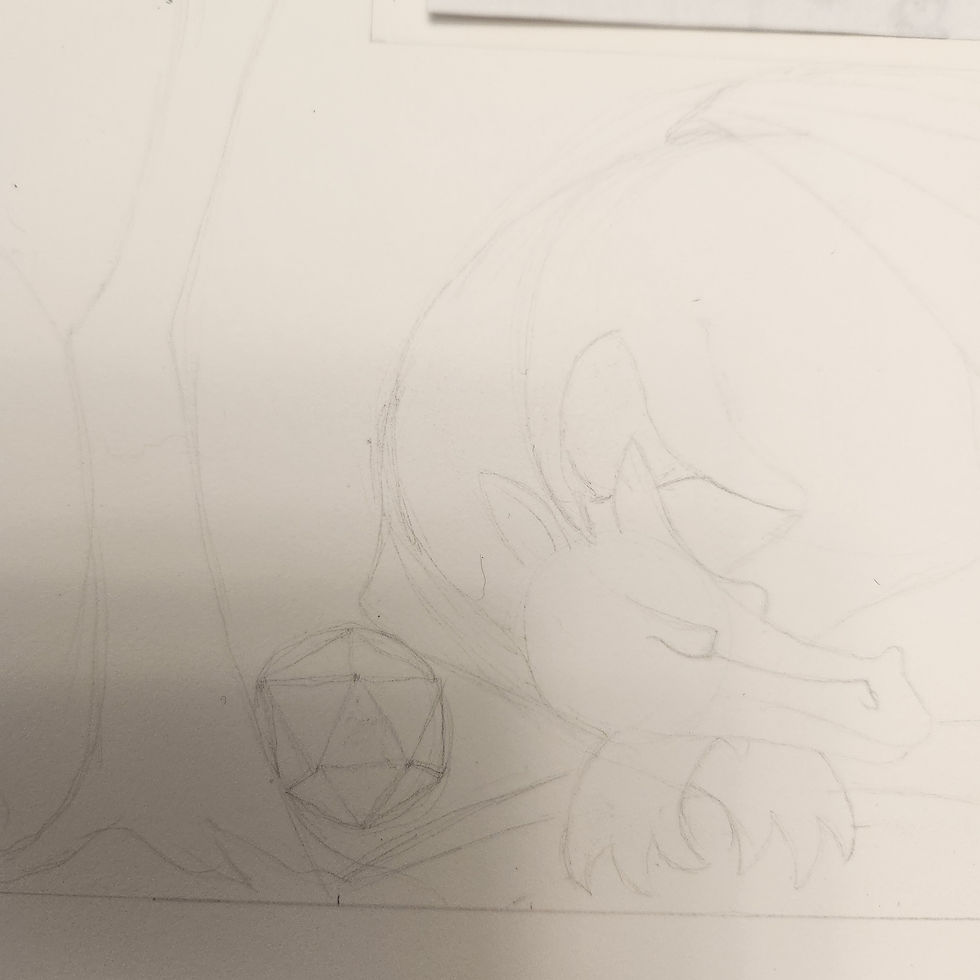
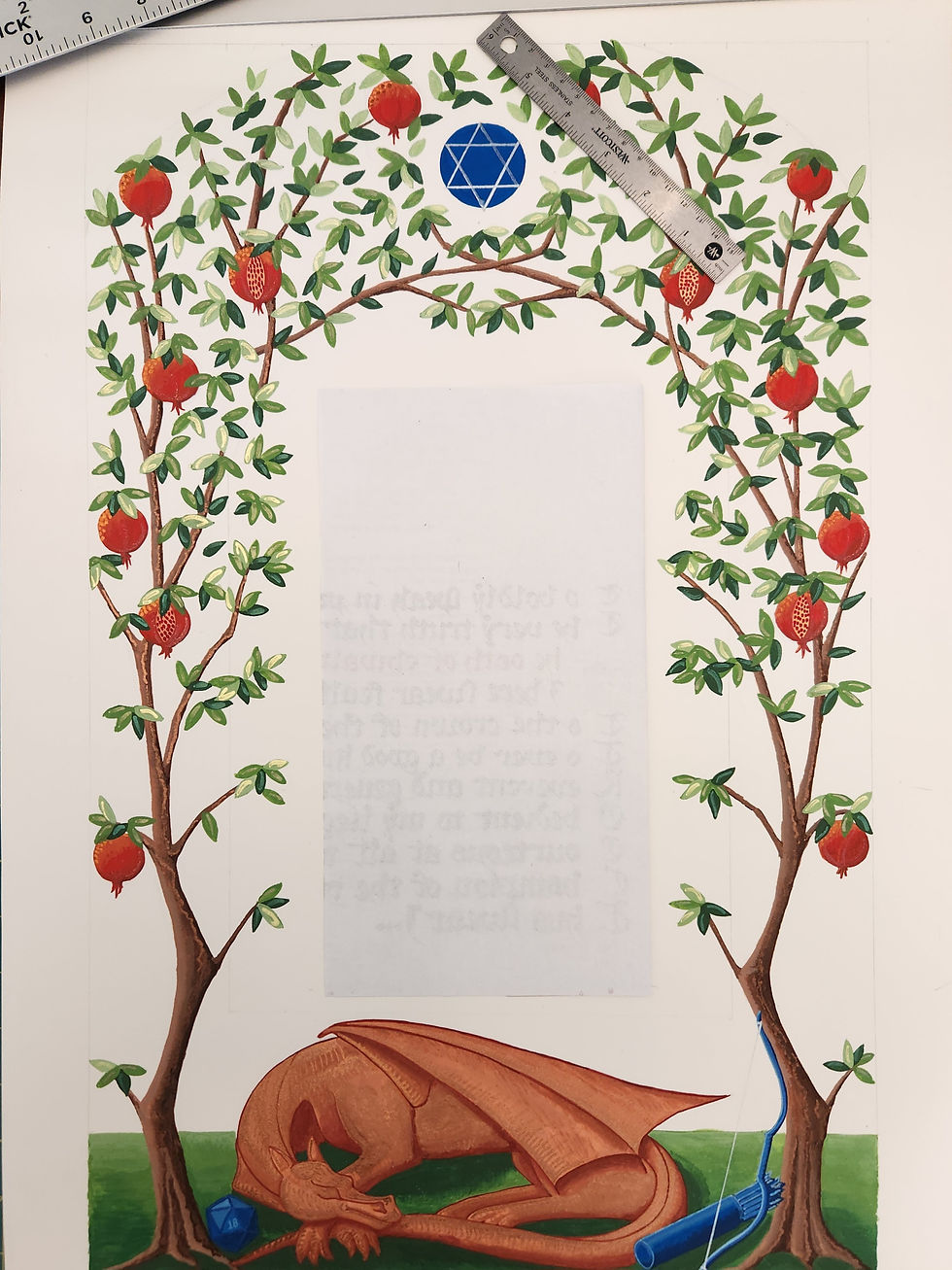
The couple wanted a combination of traditional and modern motifs. It's been a while since I did this piece, so I hope I'm remembering correctly, but as I understand it, human representations are forbidden in Jewish religious art. The couple are gamers, though, so they asked to be represented with a dragon for one of their characters, and archery equipment for the other, along with a lucky 20-sided die. The traditional aspect was covered by the pomegranate trees, an ancient symbol of abundance and righteous obligation (the many seeds can represent the many mitzvot of the Torah, for example).
I played with a few arrangements, but eventually went with arched trees to follow the shape of the text block and the modern elements along the bottom. Each tree has a lucky seven pomegranates among its branches, which also support a Star of David symbol.
Just to head off the question, in case if comes up: if you look at the photo below, you may see what looks like a "cross" in the center of the Star of David. Let me promise you I was not trying to sneak Christian symbolism into a Jewish piece. The vertical and horizontal lines are only meant to mark the approximate center of the circle in which the Star is placed.

After the pencil sketch was complete, I pulled out my kid's markers to give my clients an idea of the color scheme for the piece. The dragon is meant to be copper, which would contrast nicely with all the green elements, and then for further contrast, I used blue for the bow and quiver of arrows.


I went back and forth with the couple, adding a few details to the branches so that the arch was less artificial looking, adding in the 20-sided die, and testing whether or not to include "sky" in the top corners. Ultimately we decided against that detail, but you can see it included below.

Finally the actual ketubah arrived! It came with two copies just in case I messed up the first one, some practice scrap paper, and a very nice pen for the couple and rabbi to sign the ketubah after the ceremony. I'm not Jewish, so this isn't a product endorsement or anything, but I will say the paper was really good quality, and the printed calligraphy looked lovely.

The nice thing about doing a non-SCA piece was that I got to use materials that I usually feel compelled to avoid for the sake of authenticity. Specifically, I bought a pile of metallic paints to use to highlight the illumination. The wedding was going to take place outdoors in Florida, in the springtime. I wanted this piece to absolutely sparkle in the sun.

Of course, I did also have to mix up colors for everything from the pomegranates to the dragon. Mixing colors is still not the easiest thing for me. The main thing is that the wet colors are often a different value, either lighter or darker than they would be when dry, and it can be difficult to guess how they're going to look while you're mixing them; still, I think these look all right. And I made more than enough to use on other pieces in the future.

Then it was time to pull out the scrap paper and start test driving. I really like the contrast of greens here! The pomegranate is oversized, of course, but the point here is just to get the shading and colors figured out. The tree bark is... not great, but the colors do go well together at least.

Testing the metallic paints against the matte gouache.

At last it was time to take a deep breath and start sketching the design.


My cat, Willow, likes to supervise from time to time, as does my other cat Noodle. I use food "catering covers" to protect my work from furry little butts. They ship in pairs, and this piece is so large that I needed to use both,

Here is a test of the copper highlights on a mini dragon. No, it has no legs, but it looks very peaceful, and also very shiny.

The green shades worked beautifully together to create the ground. For the most part I worked around my shapes rather than painting over the green later with another color. Gouache reactivates when you get it wet, so there was no guarantee I would be able to paint over the green without getting muddy colors on the other elements.

I tested every element on the scrap paper before painting the real thing. Here we are adding trees around my mini dragon.

For the actual trees, I worked lightest to darkest, painting the trunk and branches in a base coat of light tan first.

After that, I went back and added darker colors, shading carefully (and often more than once) until I was satisfied. There was an intermediate stage here as well, but I eventually ended up covering almost all of the base coat before I was happy.
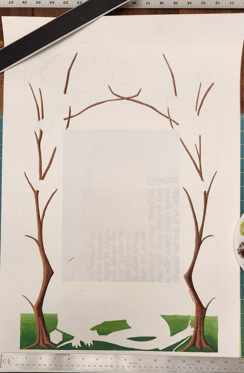
Next up: pomegranates. I'm working sort of back to front throughout the piece: grass first, then the trees, then the fruit on the trees, and finally the leaves that will cover the fruit.

I'm actually pretty happy with how all the pomegranates came out! You can see a lot of different colors blended together here.

Here are all the finished "poms."

I actually mapped out the leaves pretty carefully, based off the sketch. There were areas of varying density, and places where the leaves covered up branches that I didn't bother to paint in, and I wanted to get that final look just right.

If you look carefully here, you'll see where I've added extra branches to account for places where more leaves needed to go. The idea is to soften that arch a little bit and make it look more natural, but still symmetrical, and also add in thinner branches and twigs whose placement was uncertain before the leaves went in.

Here are all the twigs and thinner branches with more leaves added. I've made the paper cover over the text a little thinner to give myself room to work. The text itself was not to be photographed or shared until after the wedding was official, by request of the couple. I think there may have been a religious reason for that, but I can no longer recall.

The medium tone leaves look great, but when I started added in the darker leaves, the trees really started to come to life.

Finally, the light colors leaves finished the overall foliage. All that is left to do on the trees now is highlight things with metallic paint. I'm not ready for that stage yet, though.

Remember this guy? Yeah, let the adventure begin. The dragon was going to be the most demanding section of the entire piece in terms of shading and depth, and shading is a challenge for me and always has been. I always fear going too dark, and end up not going dark enough.

Step one, base coat. Interestingly, this is the same base coat as I used on the trees; while they got covered up by much darker browns, most of this base coat will continue to show through.

What follows is a truly embarrasing number of attempts to go darker with the shading. I cross-hatched first, followed by blending with a damp brush to smooth out the colors. It worked for the trees, it should have been fine here.


Since that wasn't enough, I took a darker color, a rust red I believe, and dotted it into the places that needed more shadow. Then I smoothed that over with a damp brush as well.

It came out a little better, but I started to overowrk the shadow under the wing, along the hind leg. You'll see where the paint has started lifting off and getting lighter as I go instead of darker. This was annoying, because it not only meant I wasn't succeeding, it also meant I needed to slow down, let everything dry, and then try again later.

The "lift" of color is especially noticeable here. Grr. I paused to outline everything in the darkest red I have, to see if that would add the definition I needed. It got better, as you'll see in the next picture, but I needed to go still darker.

Managed to repair the lifted paint behind the wings.

And here I finally went in with the darkest red and managed to get some real shadows in where they were needed. I could have done this first, but I was too chicken. At least now I can be satisfied.

Fortunately, the blue elements went much better. The contrast between light and dark values was much more noticeable, and the die, bow, and arrows did not turn out looking flat.
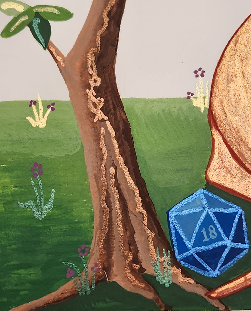
The die is painted with the number 18 visible as this is a lucky number in Jewish tradition.


The bottom of the ketubah, finally painted in.

The overall ketubah, waiting for metallic highlights.

The angle here catches the shine of the metallic paints nicely. I've got metallic highlights for every color including the brown tree bark.


I realized my dragon was looking a little floaty; I had painted the green grass but nothing in the way of shadows behind the trees or dragon themselves. So if you look here you can see where I put those in.
My dragon was meant to be copper so I used... perhaps too many highlights, to get her to look shiny enough. In certain light, her shadows disappear.

A final finishing detail: I added tufts of grass and flowers along the grass, to sort of anchor everything, in metallic colors for just a little more added sparkle.

The tufts got little purple flowers added, just because.
And here is the entire finished bottom of the ketubah...

...along with the full ketubah with text still covered. If I remember right, I finished this piece in time for Valentine's Day 2024, and the wedding was in early march. The paint did make the paper curl slightly, which you can see here, now that I've taken all the rulers and weights off the edges.

Heartfelt congratulations to the happy couple - may you have many years together and grow ever closer on your journey.


Comments