Ancient History: Pellinor's Knighting Scroll, December 2008
- Heather Bungard-Janney
- Dec 27, 2025
- 8 min read

After about 2005, I took a break of a few years from scribal activity. We had worked really hard in the Rivenstar Scriptorium, and produced some great work, but a combination of burnout and my own micromanagement of the group led to its collapse, and I took a step back for a while.
In 2008, however, an acquaintance approached me and asked if I would be willing to do the scroll for her husband's elevation to the Order of Chivalry. At that time, there were only three peerage orders in the SCA: the Laurel for arts, research, crafting, etc; the Pelican, for volunteer service and leadership; and the Chivalry, for those who fight with rattan weapons on the battlefield.
Pellinor of Shadowed Stars is a pretty great guy, and his elevation was a good enough reason to pull me out of my hiatus and back into scribing. His persona is early period, though enough time has passed that I can't recall anymore whether he was aiming for Anglo-Saxon, Norse, or Celtic/Irish. Regardless, I aimed for Celtic with this piece, which would narrow the time down to about 700-800 CE, and let the rest fall where it might.
This scroll predates smart phones, so the pictures were taken on a reasonably good digital camera, but with no specialized lighting, and no editing capability. Ordinarily I would crop and trim photos a little, but I've decided I wanted to keep these as they are. Some of them are unfortunately fairly dimly lit, or there are odd shadows across them; actually, the shadows are probably a deliberate attempt to reduce glare and show some of the details.
Anyway, here we go: the layout stage, never very exciting to look at, but crucial for the success of the piece. Looking at the photos, I believe this was my first time working with pergamenata, aka perg. It's also sometimes called "vegetable vellum," because it is a cellulose product like any other paper, but has a translucency similar to animal skin parchment. I can't recall for certain, but I'm pretty sure this is not regular paper.

The lettering complete; as always, I worked upside down. I also dripped a little wet ink toward the bottom left of the picture. I blotted what I could, but the rest needed to stay so as not to risk scraping and fuzzing the page. In general, with errors like these, you're better off to just leave them in place, paint over them where you can, and only remove the bits that still show after the rest of the work is complete.

There are a number of techniques to create Celtic knot work, but at the time I made this, I only knew of the most difficult one, espoused by George Bain in his book Celtic Art: The Methods of Construction (Dover, 1973). The man was a genius for his ability to understand and recreate Celtic knot work, but he sort of intuited what it was supposed to look like, and his methods of reconstruction were a bit counter-intuitive for a lot of the artists who came after him. George's son Iain Bain put effort into explaining his father's techniques, but the easier "grid" method doesn't seem to have come along until decades later in 1991, from Aidan Meehan's many books on the topic... which I nevertheless didn't learn about until only a few years ago, myself.
Regardless, these knots are from George Bain, who lifted them from original manuscripts or stone carvings throughout the British Isles. (Dimmer photo here to try and get the lines to show up a bit better.)

A closeup of the knot pattern. It is interrupted by roundels that will hold badges for Pellinor's personal and household arms, and awards that he has earned. You can also get a closer look at the calligraphy here, a more stylized "fancier" uncial than I usually use, featured in the Book of Kells.

Another funky, dimly lit photo, with shadows to help reduce glare on the page.

All told, I'm pretty happy with how consistent I managed to get the line width on these knots. I know that I worked out the design at least once on graph paper, but I can't recall whether I traced a finished pattern onto the perg. Knowing me, probably not. Tracing and copying "stock" images is absolutely a well-documented period practice, I've just rarely actually done it myself. Stubborn pride, mostly. I didn't transfer an image for the first time until probably 2019.

Another feature of this art style are zoomorphic shapes, meaning animals, birds, or mythological creatures that are twisted and bent into knot or letter shapes themselves. Here is the D of "Done this seventh day of August", as a peacock. I don't know when or how the Irish would have learned of the existence of peacocks, but they appear in religious art from this time period surprisingly often. The lore was that a peacock's flesh would not rot or spoil after death, making it an allegory for Jesus.

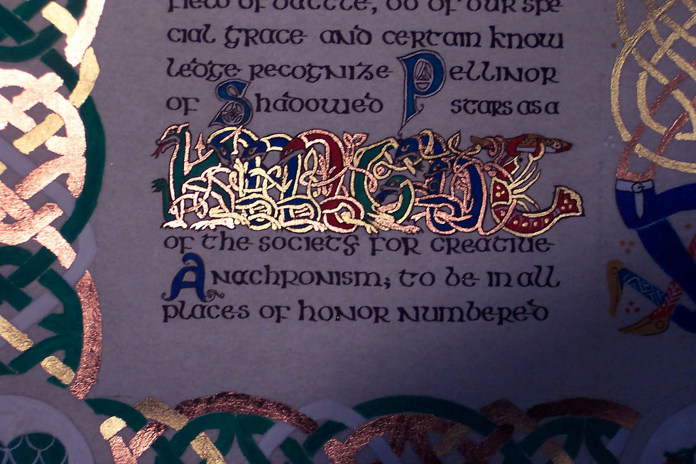
I really wish I could remember the source I adapted this from. I know I pulled it from George Bain, who pulled it from an unknown manuscript. If you look very carefully, you will see that the interlocking beasts, all with entangled legs and biting the body of the previous beast, spell the word "knight". I was especially proud to be able to use the Midrealm dragon for the K and a crayfish clutching a minnow for the T at the end. Pellinor's personal heraldry is a black crayfish with gold highlights and outline (he insists it's not a lobster) on a red field. The other letters are... oh goodness, I think from the words "In Principio" - in the beginning - from the Gospel of John, but I can't recall which manuscript anymore at all. I might be wrong about the letter source themselves, too. 2008 was a long time ago. Regardless, I remain pretty proud of this adaptation, all these years later.


Another bird and crayfish combination, forming the word "Be". The birds are adapted from Celtic art, but the crayfish is a modern invention.

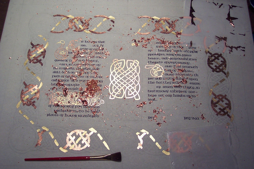
After drawing everything meticulously, it was time at last to start gilding! I started with the most finicky areas first because I was excite to see how they might come out. Celtic art in general did not use a lot of real gold substituting a very bright yellow made from arsenic sulfide, called orpiment. I have worked with some toxic period pigments, but not that one. Gold is much safer, and pretty besides.

I used a modern gilding size available from Speedball called Mona Lisa. It goes down precisely, dries to a useful level of tack relatively quickly, and can make almost any leaf behave and go where you want it to .
Another fun bit if you're a calligraphy nerd is to check out the G and Y letters in this sample. Considering my relative inexperience way back then this alphabet came out really really well.

Here is the gold about halfway done. In the center between the two columns, I've got a doubled knot pattern that will connect the body and legs of person given the zoomorphic treatment. There will actually be two people facing each other, but the second one hasn't been gilded yet...

...because I needed to use copper for that one. For the record, copper is IN NO WAY authentic to any manuscript I've ever heard of. Copper oxidizes green and would ruin manuscript pages after a couple decades, probably. On scrolls you can get away with it, beause it looks cool and because the pages will not be folded to touch each other. The patina will add character without destroying anything. In the photo below you an see where I've started adding copper to "Be" and to the "D" zoomorphs. It's a little less clear because I've got scrap all over the place, but I alternated copper and gold to do the zoomorphic "Knight" creatures as well.

Here the gilding is nearly complete. You can finally see the second knot in the center column and the lovely symmetry they have with one another.
Gilding with copper is a little trickier than working with gold. It is easier to handle because it is much sturdier than the gold, and will not stick to your fingers or to itself, but convincing it to stay down - convincing the adhesive to be sticky enough to hold the leaf without it peeling right back up again - can be a challenge. You tend to end up with a lot of scrap. For this piece, I collected my gold and copper scrap into separate bowls, and then gave it to a glassworker I know who makes beads. He used clear glass and rolled the metal into the beads, and they turned out beautifully. I wish I still had them.
A better look at the central knots. The knot itself is actually very simple, except that I split the line into two, and then interlaced the splits with each other. If you look very closely, you should be able to see where the copper goes over and under the gold.

As dimly lit as these photos are, the copper and gold really do seem to glow.

Paint down sticky, apply leaf to sticky, brush away excess. With the copper especially, there was a lot of excess.

So satisfying, once it's all cleaned up.

At last, it was time to start painting. Looking at it now, I think that green and red are pretty garish. In my defense, at the time I didn't have a lot of money, and my paints were the cheapest available because they were either what I could afford, or they were what were gifted to me by relatives. I will never look down on someone for using poor materials, because I've been there.

Besides, that bright green, red, and blue are what finally gave definition to the zoomorphic "Knight" and made it less visually confusing to look at.

Colors laid in: the roundels are now fill with, going clockwise from top left, the household arms for Darkmoon, Pellinor's personal arms, the badge of the Red Company, the badge of the Doe's Grace also called the Queen's Favor, the seal of the Middle Kingdom, and the badge of the Order of the Dragon's Heart. You can also see that the figures in the center column are meant to be the king and Pellinor himself (I dressed the figure on the left according to a photo his wife Cynthia provided). The king is about to deliver the "buffet," a ceremonial blow in the knighting ceremony that is meant to be "the last blow you receive unanswered."

At last, it was time for white detail and black outline. I'm very, very pleased with how this bird came out. A limited palette has always been a favorite of mine to work with. Here you only see the original red, green, and blue, with yellow ocher added.

These next two photos show the zoomorphs as well as the smaller initials scattered throughout the text. The center column figures here have white details but not yet any outline.


And here you start to see both the outlining and a bit of filigree around the smaller initials.

"Knight", fully outlined. The muzzles of each beast were left unpainted, so the outline is the only thing that really defines them. Again, a dim photo that nonetheless shows off the gilding. Hopefully you will take a moment to trace the shapes and colors of the letters. K is a green dragon. N is two blue beasts. I is red. G is again green, and resting on his forelegs. H is two blue creatures again, and T is a red crayfish holding a yellow ocher fish in its claws.
One last detail shot.

And here is the finished piece, at long last. I completed this about two hours before it was due to be presented, and was nearly late to the presentation, but man, the work was worth it. Pellinor and Cynthia both loved it. The only thing I don't have is a picture of it hanging in his house, which I would love to see someday.

I'm pretty sure this was also the first peerage commission I ever took, and looking back, there is a lot that I'm still proud of, even after all these years.
I hope you enjoyed this post! I'm going to try and bring more "ancient history" scrolls to this blog from my old one, little by little. Have a great weekend!


Comments