September 2022 - Arch and Runa's ducal scroll
- Heather Bungard-Janney
- Sep 25, 2022
- 12 min read

Updated: Sep 15, 2025
For the end of Runa and Arch's second reign, they commissioned me to do their ducal scroll. Arch told me I had complete artistic freedom, and that my only parameters were "Viking personas" and "make it special".
Well, I thought, okay.
And then I thought, Not another runestone. People who play Vikings always get runestones; to be fair, the historical people weren't known for creating manuscripts so much as looting them from other cultures. They did create runestones, so that's what a lot of people go with when it's time to create an award for a Viking persona in the SCA. There's nothing wrong with that, but "make it special" to me meant "no runestones".
The first visualization of this scroll was vastly different from what I eventually ended up going with. I had an idea to do a ton of gilding, showing jewelry, coins, and other accumulated Viking wealth. But my brain just wouldn't fall in love with the idea; it was an idea, but it wasn't the idea. The scroll would essentially have been a trompe l'oiel with a Viking motif, and I couldn't quite figure out how to make it work and look good without feeling weird. I did at least discover, in my research for that concept, that gold was more of an Anglo-Saxon thing, while Vikings loved silver.
I touched base with Arch to get more specific parameters, and he mentioned Jorvik, and the Jelling/Mammen style from about 1000 CE. I had never heard of Jelling or Mammen, so off I ran to the Internets, where I finally started to find inspiration. From Wikipedia I learned about the development of Viking art through the ages, and two styles, Jelling and Mammen, that were once considered separate styles but more recently were merged and considered variants on a single style. Then, from Jonas Lau Markussen's website, I was able to learn more concrete differences, similarities, and evolutions from one style into the next.

Image of Mammen-inspired motifs from Jonas Lau Markussen's website
Markussen referred specifically to an artifact called the Cammin Casket, a reliquary that was presumably destroyed during World War II, but of which numerous detailed drawings and physical replicas exist. Wikipedia shows one of them:

Replica of the Cammin Casket; image from Wikipedia.
The casket panels were made of carved elk antler, and depict animals and faces representing the four authors of the Christian Gospels: the lion, bull, eagle, and man are rendered as beasts and masks in the Mammen style. Even better, an artist going by the online name of "Feivelyn" had produced detailed images of each panel of the casket:

Panels of the Cammen Casket, by "Feivelyn". Image from Feivelyn's DeviantArt page.
For me, this image was the jackpot. The resolution on it was high enough that I was able to zoom in and get incredible detail on each panel, and I copied and cropped it to be able to see and study all 22 panels individually. I also found the inspiration I needed for Arch and Runa's scroll. Instead of arm rings and coins and necklaces, I would make panels that fit together to represent Arch and Runa, their daughter Kraken, and their son Leif.
I checked in with Arch again. I knew already that his preferred motif was a raven, but I also learned that Runa favored bears, Kraken was of course self-explanatory, and Leif liked wolves. Add in a Midrealm dragon, and I had five panels that I could fit together in the ovoid shape of the original casket itself. I'd use silver to fit the Viking preference for it over gold, and I'd band them in copper, because copper would look cool. For contrast, I'd put all of this on a black ground rather than white, and also partly because I'm becoming known for my work with black scrolls, so it would be a subtle way to put my own self into the piece. Trust me when I say that this is the only subtle thing about the entire scroll.
Ordinarily, I do calligraphy first, but my text was coming from the lovely Dame Ursula Mortimer, who was at Pennsic, and unbeknownst to me was also working on text for my elevation to the Laurel (more about that in a previous blog post). She asked me if I could wait until after Pennsic to get the text, and I said sure, as it would give me time to work on the illumination and make sure I had it ready in time.
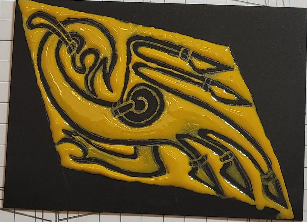
First was the scale model: I love working with graph paper to get true thumbnail sketches of my pieces. There's something about seeing them in tiny scale that really helps me get a feel for the overall composition of the piece.

By and large, the image is sort of terrible; the finished critters look a lot different in the finished piece, things are a little sloppy, you know, stuff like that, but that's not the point of the drawing. The point is a concept, and proving to myself that it will look at least okay. I decided this was going to look very okay.
Next it was time to test the gilding. If I was going to have a metric boatload of gilding on this piece, I needed to know I was going to get it right from the start. I also wanted to texture the animals, and possibly the background, in different ways to make it look more like the carved antler of the original casket. But I still wasn't completely sure how to make that look good, so I did a couple of test cards with my gilding base to play with various "looks" for the critters:

All this really helped me get a feel for the medium as well, because the gilding base, Instacoll, is ordinarily very thick and goes down much more smoothly if it's diluted about 50/50 with water. You can see my notes here on the cards as I worked through various options to try.
To make sure I got the drawing style right, I also referred to YouTube, where I found a video from the Ansteorra King's College online classes on how to draw Mammen style art, utilizing the same website I had already found as its main source (the video below is a recorded Zoom class that runs for about one hour):
The trick to drawing these is to treat the outline as a "ribbon" that traces the shape of the critter, and in some places add "pellets" that look a lot like pins, holding the ribbons together in narrow or tight areas. Here's the next test card, the one I liked best and decided to actually gild for texturing practices:
Note the "pellets" along the spiral, the weird wing tips, and the tips of the tail feathers. This critter is not quite what I wanted for Arch's raven, but it was close enough to give me a feel for how to draw everything and gild it:

The critter is stippled with a stylus in a few different patterns and sizes. The background, up near the wing, was painted in dots and then painted over with a thin layer to create that pebbled effect. I liked it, but it ended up looking like it would be too much work for the final piece, so I ultimately abandoned that option.
Finally, it was time to start drawing the panels. Here is the first incarnation of Arch's raven:

The Kraken:

Runa's bear, with a little tree-like thing to fill space:

And finally, Leif's wolf:

The four small panels together:

A number of people have asked what I use to draw on black and have it show up so well, but it's just ordinary mechanical pencil with a #2 lead. The black is Strathmore 400 mixed media paper. I buy it in pads because I go through quite a lot of it.
The dragon, being so much larger, needed to go last, but I'm thrilled with how he turned out.

The five panels, almost ready to go:

And the overall scroll, showing two columns for the poem that Ursula would write for me:

The only thing was, Arch's raven, having been the first thing that I drew, looked a little wonky in comparison to the other four animals. I ended up redrawing it completely, to look a bit more like them. I liked this version much better.

Finally, it was time to begin the long slow process of gilding. As stunning as the results look, the process is always surprisingly simple: paint down sticky, apply gold to sticky, brush away excess. Here's the Instacoll for the kraken:

I wanted to test something else, so here I textured the Instacoll before adding gold, to see if it would take the gold well, or if I needed to reverse those steps: gild and then texture.

I'm using 12-karat "white gold" instead of pure silver here; white gold is about 50/50 gold and silver, with a little bit of palladium added in. It will still tarnish, but not as quickly as silver, and hopefully not as severely.

Brushing away the excess, usually my favorite part, answered the question for me: texture afterward, or the gold won't go into all those little divots well enough to stick. You can see hints of yellow showing on the head and along the tentacle tips at the bottom of the panel.

Fortunately, a second layer of gold did the trick just fine, and I was able to take a shot at an angle to confirm it (and also because getting an extra look at that shine was just fun).

Working with wet Instacoll, each critter had to be laid down all in one stage if at all possible. It usually took me about an hour or two per panel.

Paint down sticky, lay gold over sticky...

Brush away excess. I'm very pleased with how the Instacoll behaved; I've worked with modern sizes before that shrank and then wrinkled as they dried, ruining the smooth effect I was going for. Here I've got almost a mirror finish, and it's really exciting to see.

These styluses are called "embossing styluses" and you can get a three pack in various sizes for about $5 at Michael's.

I love the juxtaposition of the textured critter against the smooth background. It's pleasant to touch as well, though I tried to avoid doing so for the most part. My skin oils may end up speeding the tarnishing process, farther down the line.

You can see how the "ribbon" style of the drawing lends itself really well to this gilding effect; I end up with a solid black outline, and gild all of what would usually be negative space.

Remember how I said that the critters needed to be done as a single stage? Unfortunately, two or three hours into the dragon, I had no choice but to stop for the day. Fortunately, the shape of the piece left me with small areas that I could fill completely, rather than leaving something half-done and risking messing up the smooth finish of the Instacoll.

The next day, finishing the dragon only took about a half hour, so I used the rest of my session to do Runa's bear as well.

Man, I love it when the gold behaves, and the dragon came out beautifully. The weird bright spots you see at the base of the neck and into the shoulder are actually just light reflections, possibly a camera artifact from glare, because the gilding was just that smooth.

I wanted the flow of all those textured dots to follow the contours of the critters, so I couldn't just stab at them randomly. As I recall, I listened to a lot of swing and big band music for this stage, and let myself get into the rhythm of the music as I laid the patterns down.


I was so, so pleased with how the dragon came out.

The texturing does more than just change the feel of the piece; after all, we don't want to touch this once it's framed and hanging on the wall. The dimples also change the way the light reflects off the piece, as you can see in this photo taken from a more shallow angle. The background dims a bit while the dragon remains bright.

Runa's bear, complete.

The full panel, with only Arch's raven to go. (It took me this long to figure out a better way to light these photos...)

At long last, the raven is complete, and here are all the panels. Now it's time to lay the copper bands between them.

I originally thought to texture these by painting dots of Instacoll, then covering them with a thin layer of more Instacoll, to give a pebbled or hammered effect. But I was feeling a little impatient, and concerned about running out of time to finish the piece. So I laid the Instacoll down smoothly instead.

Ursula was able to get the text to me around this time, so I thought I would give myself a little break, and test out the words in the space I was given. The image below puts the majority of each letter on every third line, saving a line each for ascenders and descenders, and uses a nib that I frequently use for a bolder look to the text. Not too thick, not too thin.

However, it didn't look quite right. The rest of this test piece uses a thinner nib, and spaces the letters every fourth line, giving extra room for the descenders below letters such as y, p, r (in this script, r is a "long" letter), g, and so on.

The script is called "insular minuscule" in Drogin's book, Medieval Calligraphy: Its History and Technique, and is one of my favorites because my own handwriting has exaggerated ascenders and descenders naturally. Playing with that in this script always feels very comfortable, and I wish I had greater opportunity to use it. Instead of Drogin's exemplars, however, I'm pulling from a digitized manuscript dated between 960 and 990 CE, called the Exeter Book, which is a collection of poems in Anglo-Saxon, or Old English. It is considered one of the most important, foundational manuscripts in what would become the English language. There is a different handwriting sample on almost every page, often more than one, and they're nearly all just beautifully legible.
After having a little fun with the script, I went back to the copper. It did not want to behave. Copper leaf is much thicker and thus sturdier than the gold I usually work with. You can actually hear it tear when you brush away the excess, and it reminds me almost of aluminum foil because it's comparatively so heavy. Gold leaf is so lightweight that it's actually translucent when held up to the light! Copper... is not. Instead of lay down leaf over sticky and brush away excess, it was lay down, try to tear the copper, watch as it peeled right back up again, completely intact. I had to cut the copper sheets into strips, and cover the Instacoll in a flat gilding size, to get it to stick at all.

Here's a closeup of the copper, doing its damnedest to ignore everything I'm asking it to do. All that tan is the Instacoll still showing around ragged edges, where the copper utterly refused to stick.

Fortunately, I have worked with copper before--specifically, on the very first scroll that Arch asked me to create for his first reign, in 2011--and I knew there was an adhesive that would make it behave. I just didn't happen to have any on hand at the time, so after experimenting with other adhesives, I finally gave in and ordered some of that. It's called Mona Lisa gilding size, it's made by Speedball to use with their artificial gold leaf, and it's strong enough for use outdoors if I remember correctly. That stuff will make copper behave.
In the meantime, while I waited for the Mona Lisa to arrive in the mail, I worked on texturing the areas that didn't suck, and went ahead and laid out the calligraphy "for real" this time.

Love those descenders. You may read the full text of this poem, in a modern script, at Ursula Mortimer's blog, along with explanations of the verse's style and some of the specific word choices she made. It's a pretty fascinating read, and a lot shorter than this post as well.

Another calligraphy test. I replaced the word "and" with an abbreviation, and inserted the year after the word "September".

The ink in this case is actually Coliro gold paint, formerly known as Finetec. It is a lovely paint to work with, and when diluted far enough, flows just fine from a dip pen.

At last, the full text of the poem, all four stanzas, is on the page, and it's a perfect fit in both columns, and across the bottom. I am really pleased with how it came out, as well as how it balances the copper and silver of the illumination. I considered using silver ink, but for one, it doesn't go on quite as opaque as the gold, and for another, I asked Runa if, without giving any surprises away, she'd rather have the piece be all silver, or have a touch of gold for accent. She requested gold, so here we are.

Here is the piece with the copper completed, textured, and the pencil lines erased from the text columns. All that's left to do is sign the back, and hope that the recipients like it.

These next four photos are the individual stanzas of the poem; I include them for anyone who enjoys lettering as much as they do decoration, and for anyone who wants to try and read the words as written in an ancient style.


And finally, a scroll isn't worth anything if the recipient doesn't like it; here is the piece being presented in court. I especially liked this shot of it, because the light hit the scroll perfectly from that angle, and it just lit up beautifully.

Both Runa and Arch assured me afterward that they loved it, which is really the outcome that matters most. I've received many lovely comments from people who got to see the scroll in person, and I am thrilled to see that it turned out and was received as well as I'd hoped. A piece like this, with only the parameter to "make it special", could have been too over-the-top, too garish, or just too much. It's certainly not subtle. So I'm very relieved that they liked it, after all.
Now that it's complete, I am going to rest a few days, clear off my art table of all the copper scraps, eraser bits, and cat hair, put my tools back in their proper homes, and then return to working on Bran's knighting scroll. I don't know if I'll take many court assignments between now and the completion of that piece, because I want to devote as much of my energy toward it as possible until it's done.
If you've made it to the end of this post, I thank you for your attention.


Have Mona Lisa size and silver and copper leaf...must behave. Must work on current projects. That is absolutely stunning.